Mastodon

Bank of England

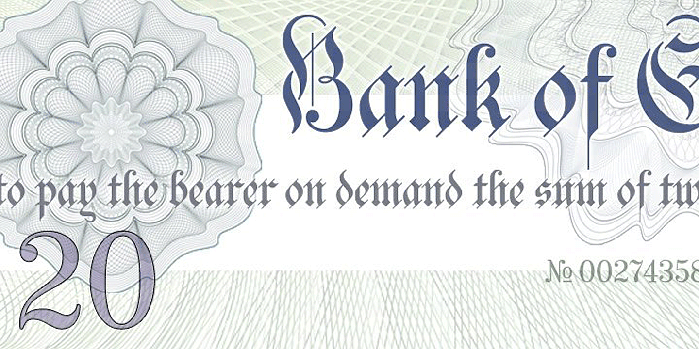
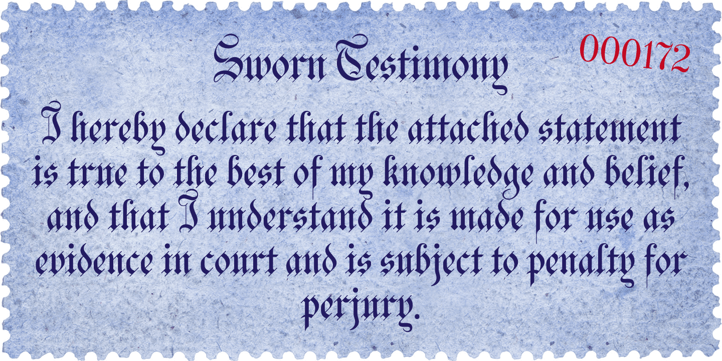
About Bank of England

Bank of England is loosely based on the blackletter lettering from Series F English twenty pound banknotes introduced in 2007. The font takes inspiration from German Kanzlei (Chancery) typefaces and the English calligraphers John Ayres and George Bickham.… Check it out on FontBros.com

People also explored

Previous article
Next article

LEAVE A REPLY

Please enter your comment!
Please enter your name here

Unlock Endless Creativity with the FREE September Clipart Huge Bundle (Valued at $700!)

spot_img

Personal Use Free

BLOG

To increase your work productivity, choose the most readable fonts.

In today's fast-paced work environment, where digital communication and information consumption are integral to our daily routines, the choice of fonts can significantly impact...