Cabo Slab: An Elegant Slab Serif Font Family
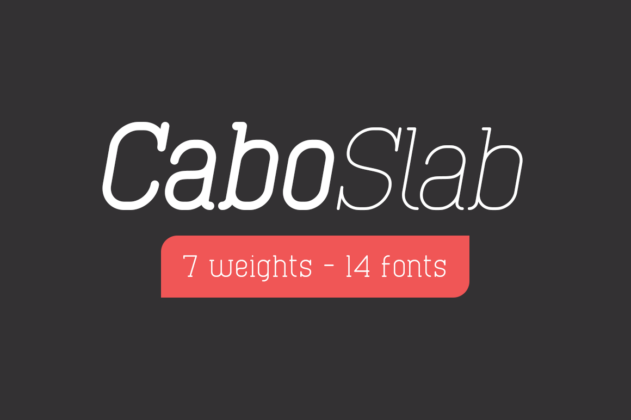
Cabo Slab is an elegant slab serif font family that offers versatility and style for various design projects. This font family is based on its sans serif counterpart, Cabo Rounded, bringing the same modern aesthetic to the slab serif category.
Key Features of Cabo Slab
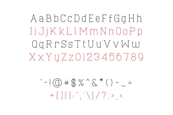
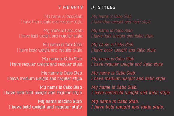
- Extensive Family: Cabo Slab comes in 7 weights and 14 styles, providing a wide range of options for designers.
- Elegant Design: The font combines the structure of slab serifs with a refined, contemporary look.
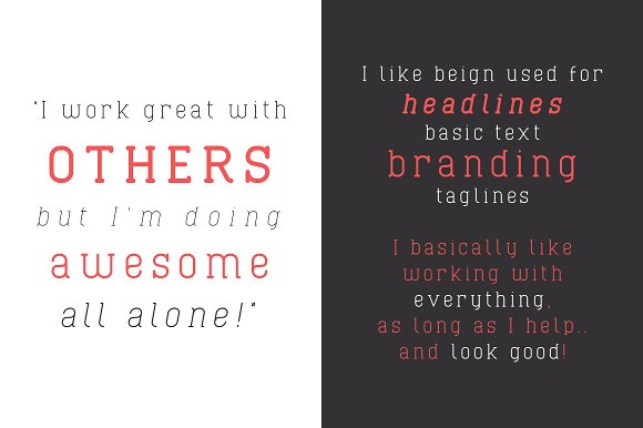
- Versatility: Suitable for various applications, from branding to editorial design.
Applications and Uses
Cabo Slab’s versatility makes it an excellent choice for:
- Corporate branding and identity design
- Editorial layouts and magazine designs
- Web design and digital media
- Advertising and marketing materials
Comparison with Other Slab Serif Fonts
While Cabo Slab offers a modern take on slab serifs, it stands apart from more traditional options like Tecnica Slab Family or the playful Klub Katz. Its range of weights and styles allows for more flexibility in design compared to single-weight slab serifs like Rifleman.
Design Considerations
When using Cabo Slab, consider the following:
- Utilize the range of weights to create hierarchy in your designs
- Pair with sans serif fonts for contrast, perhaps even with its counterpart, Cabo Rounded
- Use heavier weights for impactful headlines and lighter weights for body text
Conclusion
Cabo Slab is a valuable addition to any designer’s toolkit. Its combination of elegance and versatility makes it suitable for a wide range of projects, from corporate communications to creative designs. Whether you’re working on logo designs, website headers, or print materials, Cabo Slab offers the flexibility and style to elevate your typography.
Explore the Cabo Slab family to discover how its various weights and styles can enhance your design projects and bring a touch of modern elegance to your work.
