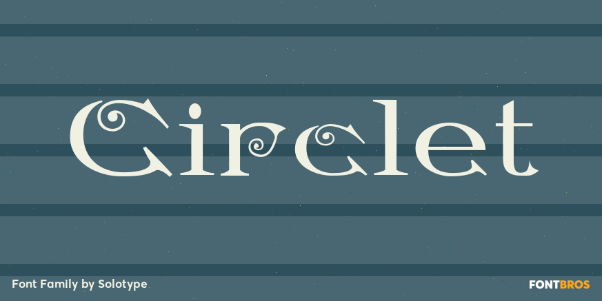
Mastodon

Circlet

About Circlet

Like many of the Victorian decorative fonts, this one had caps only when Barnhart Bros. and Spindler brought it out. In 1990, we decided to draw a lowercase for it, making it more versatile. A good font for period typography. Check it out on FontBros.com

People also explored

Previous article
Next article

LEAVE A REPLY

Please enter your comment!
Please enter your name here

Unlock Endless Creativity with the FREE September Clipart Huge Bundle (Valued at $700!)

spot_img

Personal Use Free

BLOG

To increase your work productivity, choose the most readable fonts.

In today's fast-paced work environment, where digital communication and information consumption are integral to our daily routines, the choice of fonts can significantly impact...