About Go Nuts Font
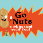
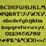
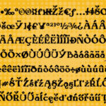
This thick and bold serif font effortlessly combines strength and playfulness, featuring a whimsical bend that adds a touch of charm and character. Its substantial and weighty appearance gives it a commanding presence, while the whimsical bend introduces a unique and light-hearted element, creating a harmonious balance between boldness and playfulness.
The serif design of the font contributes to its robust and substantial visual impact, making it well-suited for projects that demand a strong and authoritative presence. Each letter stands tall and confident, conveying a sense of reliability and stability often associated with traditional serif typefaces.
What sets this font apart is the whimsical bend infused into its design. This playful element adds a dynamic and creative twist, elevating the font beyond a standard, rigid presentation. The slight curvature introduces a friendly and approachable aspect, making it suitable for projects where a touch of personality is desired.
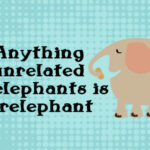
Whether used for headlines, logos, posters, or any other design application, this thick and bold serif font with a whimsical bend stands as a versatile choice. It combines the best of both worlds—strength and a bit of light-hearted flair—making it suitable for a variety of contexts where you want to make a bold statement with a hint of playfulness.
In summary, this font is not just about thickness and boldness; it’s a design asset that brings a delightful whimsy to the table. Its unique blend of strength and playfulness makes it a distinctive choice for designers seeking to make a statement that is both powerful and approachable in their creative projects.
