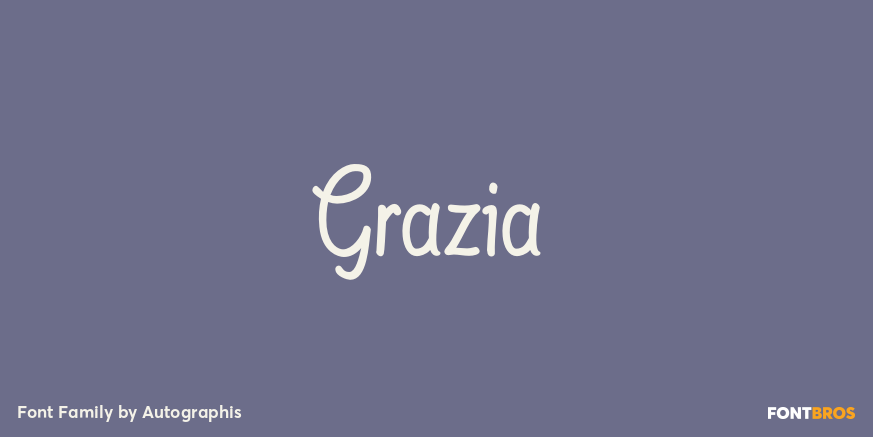
HomeFont BrosScripts: CasualGrazia Scripts: Casual Grazia FacebookXPinterestWhatsApp 1 of 1 About Grazia Grazia is a joining script with zero contrast. That means that I designed the line of the letters so, that they look equally thick all the time. The script is almost upright and has this 1930s look to it. Check it out on FontBros.com DOWNLOAD NOW People also explored Ruthless Riveruta Font Valentine Vanilla Font Zacharias Font Magier Schrift Font Robert King Font Loving Yourself Font Above Ground Font Saturday Holiday Font 342 0 TagsGraziaGrazia Font Previous articleFilmotype GemNext articleTough Cookie LEAVE A REPLY Cancel reply Comment: Please enter your comment! Name:* Please enter your name here Email:* You have entered an incorrect email address! Please enter your email address here Website: Save my name, email, and website in this browser for the next time I comment. Personal Use Free Unsteady Overseer Personal Use Free Read more about this font Hatia Script Personal Use Free Read more about this font Allea Sweet Personal Use Free Read more about this font Evensong Hollow Personal Use Free Read more about this font BLOG Using Fonts in Digital Marketing: Tips to Strengthen Your Brand Identity In the realm of digital marketing, every visual element plays a crucial role in shaping a brand's identity, and fonts are no exception. The... Free vs Paid Fonts: Why Investing in Premium Fonts Is Worth It Modern Sans-Serif Fonts That Brands Love in 2025 Elegant Wedding Invitation Fonts – Handwritten & Script Fonts


