About Kammerlander Font
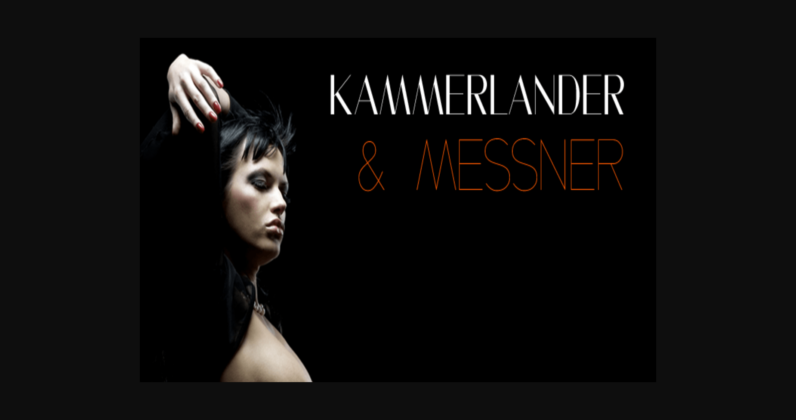
Kammerlander and Messner is an art deco font family. This typeface has three styles and was published by Juraj Chrastina.
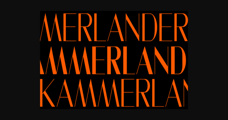
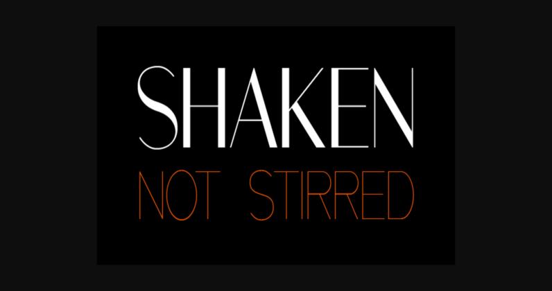
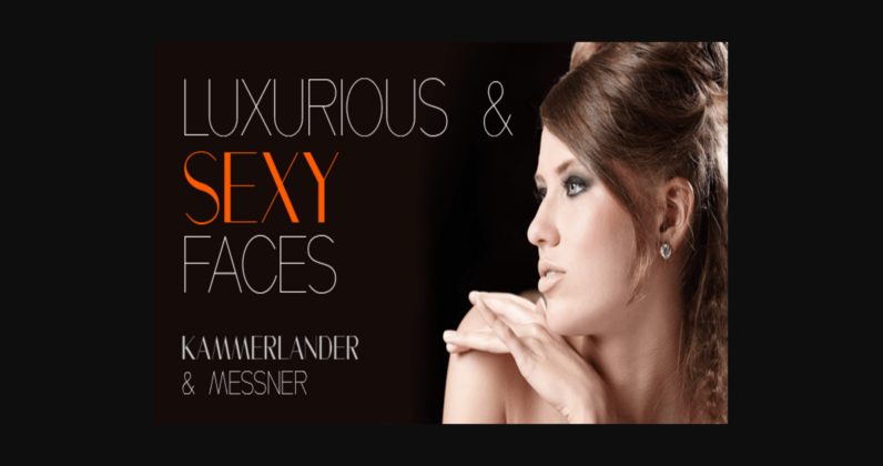
Kammerlander is a sans typeface with a distinctively strong thick/thin contrast. It’s based on Messner- a hairline font with a constant stroke weight, so their combination looks very natural. They look great in fashion magazines, in the expensive world of beauty and glory.
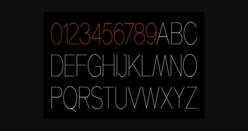
Kammerlander is an all-caps face, especially suitable for larger sizes.
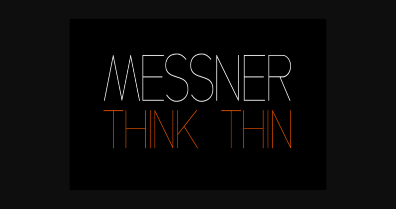
Hairline fonts are very clean, shining, elegant, and even luxurious. They look great in fashion magazines, in the expansive world of beauty and glory.
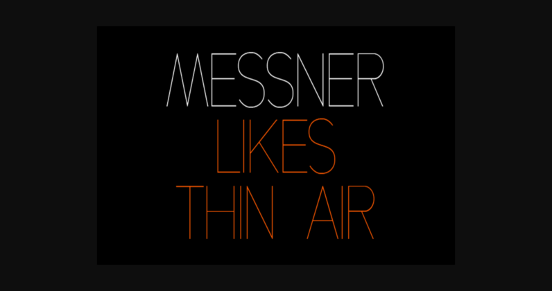
Messner is an extra-light all-caps face, especially suitable for larger sizes. The simplicity, purity, and readability of its classic forms were in the first place in the creation process.
Messner was a resource for designing the Kammerlander family and their combination looks very natural.
