About Mandevilla Family Font
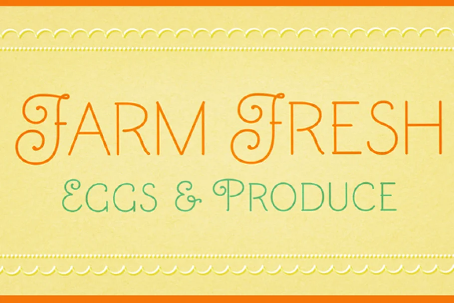
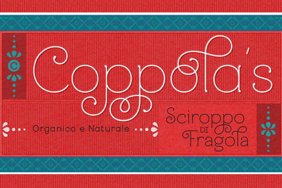
Creation of this typeface for titling, display, and logos was inspired by my exploration and drawing of forms found in nature. Refined, quiet and elegant, yet quirky enough to employ slim filaments that somehow are not faint of heart, Mandevilla is named for the verdant tropical vine. The sturdy plant has firm footing in the soil, then climbs, curving around trees, stretching toward the light, bridging earth and sky.
Mandevilla began as a sans-serif, but its footing, in the form of tiny round lachrymal terminals, roots it and transforms it into a semi-serif. From there the tendrils spiral—especially in the uppercase letters, with their echoes of nautilus shells we held to our ears to hear the ocean—and embrace slender, airy ascenders that tenderly but determinedly rise heavenward. As I sketched, I played with curliques, beginning with the uppercase A. My process usually begins with lowercase letters, but I was fascinated by the spirals and the references to nature, and how that swirl swept around the A, B, and Q, giving each a delicately different personality, within a softly stated whole. The sweep of my pencil both interrupted and completed the diagonal stems of the A and the K, and this idiosyncrasy intrigued me. How would this theme work its way through the alphabet? When I was finished, I sensed spun sugar, or the vines of a delicate plant—and thus its name, Mandevilla.
From there, I moved to the lowercase letters, and sought simplicity to balance the embellishments in the uppercase letters. Round, open, friendly, warm, with just a whisper of the Art Deco period, they soften the more ornate letters yet confer a touch of clarity. Born as sans-serif shapes, their terminals now carry a hint of drops of dew, shifting them to semi-serifs.
ALTERNATES
Alternates are included to allow for versatility, so each design has your unique twist. While the Mandevilla default is decorative, the titling set is unadorned and non-stylized, yet still capturing the airiness of the typeface. Access them in the Open Type panel as Titling Alternates, as seen in the User’s Guide. They’re useful in some larger text settings or simply if the design calls for a more standard look.
Also included are a 3/4 size set, listed and found as small caps. Small caps are typically the size of a lowercase letter, but these 3/4 caps are about 80% of the height of the uppercase letters. They are useful for all uppercase settings—used together, they maintain a sense of a word shape because they are smaller and less ornamented than the initial cap and are serif-free.
A set of swashes offers both upper and lowercase variations, with an especially rich selection for each lowercase letter.
Mandevilla includes a downloadable User’s Guide, 950 glyphs, and 210 alternates, including sets of uppercase and lowercase letters (both swash and standard—the standard are listed in the User’s Guide as “Titling Alternates”), and 3/4 uppercase alternates listed as “small caps.” Thirty-eight ornaments complete the package. May your type rise up to meet you as you work!

