In today’s fast-paced work environment, where digital communication and information consumption are integral to our daily routines, the choice of fonts can significantly impact our productivity. The readability of the text on our screens plays a crucial role in reducing eye strain, enhancing focus, and ultimately increasing work efficiency. In this regard, selecting the right fonts becomes a key consideration for those seeking to optimize their work environment.
One of the primary factors to consider when choosing a font for work-related tasks is readability. Fonts that are easy on the eyes and have clear distinctions between characters can contribute to a more comfortable reading experience. Sans-serif fonts, such as Arial and Calibri, are often recommended for on-screen content due to their clean and straightforward design.
Another important aspect to consider is font size. Opting for a font size that is neither too small nor too large is essential for preventing eye fatigue. Aim for a font size that allows you to read comfortably without squinting or straining your eyes. The standard recommendation is to use a font size between 10 and 12 points for body text.
In addition to font choice and size, font spacing, also known as kerning and leading, plays a role in enhancing readability. Ample spacing between characters and lines can improve the flow of text and make it easier for the eyes to follow along. Fonts with appropriate spacing, such as Verdana and Tahoma, are often preferred for their legibility.
For those who spend extended hours working on documents or reading on screens, it’s advisable to choose fonts with high x-height—the height of lowercase letters like ‘x’ relative to uppercase letters. Fonts like Georgia and Trebuchet MS, with generous x-heights, are known for their readability and are suitable for long-form content.
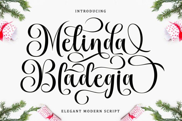
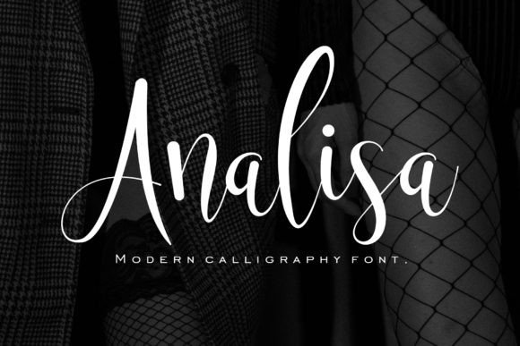
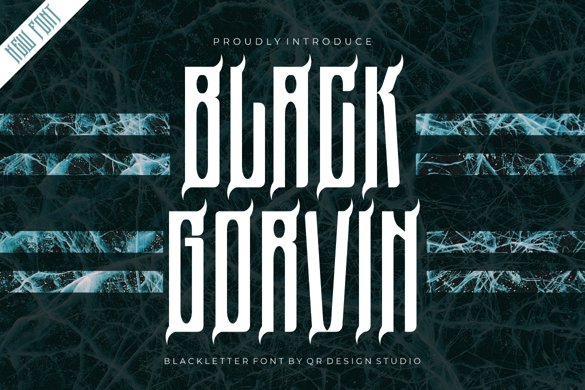
Moreover, consider the overall aesthetic of the font. While decorative or elaborate fonts might be visually appealing, they can be challenging to read in large chunks of text. Opt for fonts with a balanced mix of style and readability, striking a harmony that complements your work tasks.
In conclusion, the impact of font selection on work productivity should not be underestimated. By choosing fonts that prioritize readability, appropriate sizing, and spacing, individuals can create a work environment that supports efficient information processing and reduces the risk of visual fatigue. Experiment with different fonts to find the ones that resonate best with your preferences and contribute to a seamless and productive workflow.
