About Wrong Font
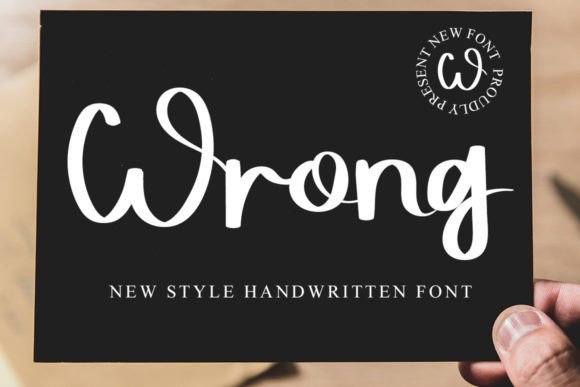
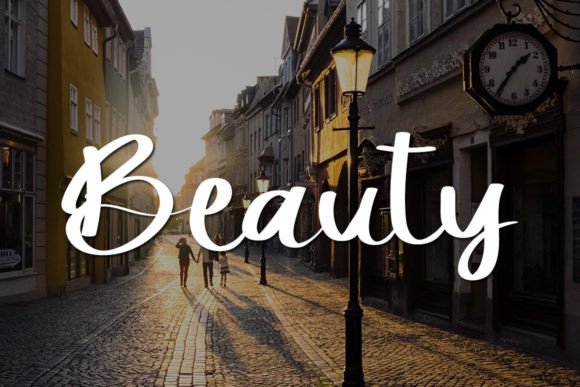
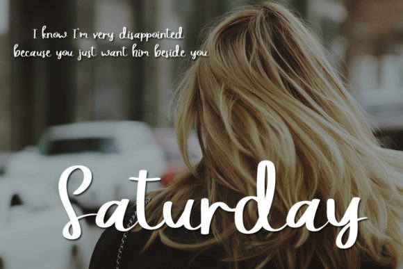
“Wrong” is a charming and sweet handwritten font that exudes freshness, cleanliness, and elegance. Its versatile appeal makes it an excellent choice for a wide range of projects, spanning both formal and informal contexts. Incorporating “Wrong” into your designs promises to infuse an incredibly joyful touch, enhancing the overall aesthetics of your creative endeavors.
This font’s allure lies in its ability to adapt seamlessly to various design scenarios, making it suitable for both formal documents and more casual creative projects. “Wrong” adds a delightful and distinctive character to your text, bringing a touch of warmth and personality to the forefront.
The fresh and clean aesthetic of “Wrong” makes it a perfect companion for projects aiming to convey clarity and sophistication. Its sweet handwritten style not only elevates the visual appeal but also adds a layer of charm, making it an excellent choice for a wide range of applications in both business and personal contexts.
Incorporating “Wrong” into your designs simplifies the creative process, leveraging the font’s design to effortlessly enhance the overall visual impact. By using this font, you introduce a level of beauty and uniqueness that captures attention and contributes to a memorable user experience.
For businesses, utilizing “Wrong” can contribute to a more beautiful and engaging brand image. Whether applied to logos, marketing materials, or promotional collateral, this font brings a unique elegance that sets your business apart and elevates its visual identity.
In summary, “Wrong” is not just a font; it’s a design asset that adds beauty, joy, and elegance to your projects. Its sweet handwritten style, combined with its versatility, makes it a valuable choice for a variety of creative endeavors. By incorporating “Wrong” into your designs, you simplify the process and ensure that your creations radiate a delightful charm, making your business and projects more visually appealing and memorable.
