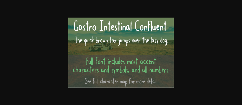
About Gastro Intestinal Confluent Font
The Gastro Intestinal Confluent font, which is spooky and tall, was a follow-up to an original Gastro Intestinal font released in December 2000. I didn’t like the original because it wasn’t “solid” enough — too thin and not very legible. Eventually, after making this version in January 2001, I pulled the original altogether. According to my early notes on the font, “I got the name from an anatomy poster on my wall, titled ‘Motility and the Gastro-Intestinal Tract.’ It’s kinda gross (the poster.)” Who knew?
