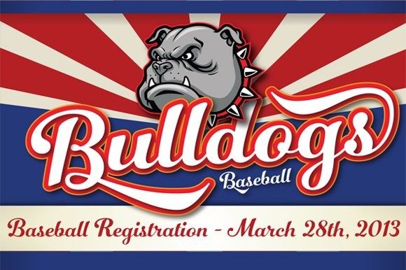
- Number Five Smooth Font Poster 2
- Number Five Smooth Font Poster 3
About Number Five Smooth Font
Number Five is pure Americana, suitable for titling, display, logo, signage, and editorial work. Its two versions, Smooth and Rough, are constructed similarly, yet imbued with distinct feelings and uses.
The 1940s and 1950s in America have taken on a mythology of their own, imagined by some as an idyllic time when the daily life, dreams, and sensibilities of a nation were stable, solid, unchanging. Yet this was when the same mothers who sewed their children’s names onto collars for summer camp using needle and thread and who picked berries at roadside fruit stands to lay up ruby and purple jams for the winter, also read books about scientific parenting, squeezed high-end appliances out of slim budgets, and dreamed of Jetson homes.
What we now treasure as “retro” was a time of powerful transformation, as the extraordinary beauty of the handmade past slipped slowly toward the outmoded, and as a nation we became restless for a manufactured perfection. How perfect, indeed, that we’d soon be watching as one while one of our own stepped onto the surface of the moon.
Number Five captures the moments before we moved into our Brave New World. The letters are subtly retro and just barely distressed, and are evocative of Betty Crocker cookbooks used by women in high heels and crisp aprons, signs painted on old barns along the highway, and slow summer days with Joltin’ Joe Dimaggio (and his number 5 jersey) at bat. This was a time when modern machine-made was adored, yet handmade was the norm, and the functional hand-drawn still had a beauty all its own, whether or not we could still discern it.
My motivation in designing Number Five (which was named not for Joe but for my own jersey, my favorite number since childhood, my lucky charm), was to capture this time of Jim Beam, plaid Bermuda shorts, laundromat signs, and hometown storefronts beckoning with freshly painted sign painter’s scripts. The human spirit still ruled in what we made, back in these days when Main Street, not Big Box stores, prevailed—and even when the edges of our goods were rough, the work spoke of warmth and a practiced hand.
The lettering is bold and dark, beautiful but not especially feminine or even sophisticated, a casual down-to-earth script. Like many of my fonts, the letters grew organically, possibly triggered by watching an old movie or remembering the cheers when I was a kickass Little League pitcher. I used pencil to construct them, then scanned and finessed them on the computer. Constructed faces are carefully crafted and demanding, they don’t flow naturally from the pen or brush. Yet, designing the letters was hard work that came easily compared to others I’ve made; I drew the outlines on a single sheet of paper, which is unusual for me; perhaps the letters had a strong American identity running through them from the start and I simply followed them to completion. I intuited the direction I was headed: unpretentious, friendly, oddly familiar—as “retro” should be.
The two versions are kissin’ cousins, lending themselves to different purposes and kindling a different feeling, as similar as they seem at first glance. Smooth is the slick version; I think of a pale, crisp, clean lager. Rough is the nut brown ale, or, taking it back in time, the neighborbood’s hardware store sign, at the center of town.
TECHNICAL: Number 5 has 433 alternates, including a set of unconnected letters (the default set is all a connected script), and ten ornaments.
